User Experience // Product Innovation
Inhaler
This was a product redesign focused on improving the user experience of pharmaceutical inhalers.
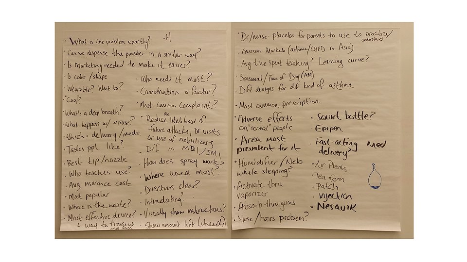
First we defined any questions surrounding the problem and brainstormed any ideas that immediately came to mind.
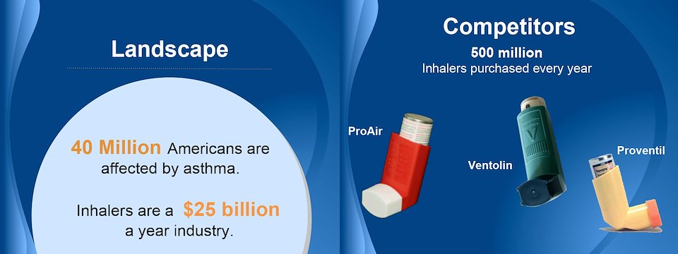
Next we researched the market, identifying key competitors and areas of opportunity. Recent regulations drastically consolidated the market to a few key players.
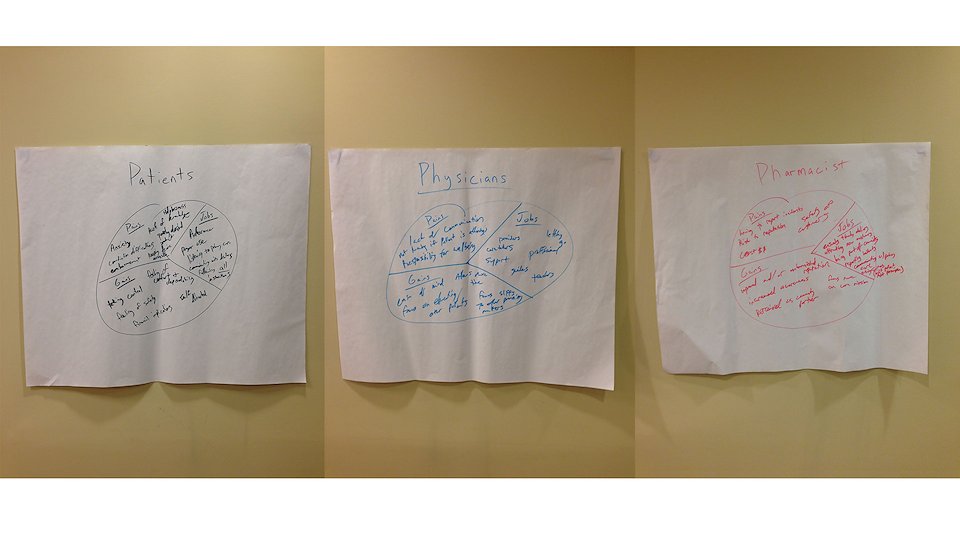
Empathy mapping – essential to the process. We looked at our key stakeholders and what pains, gains, and jobs they have in the current inhaler market.
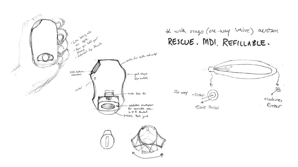
Some initial rough sketches after preliminary research and interviews were completed.
Mockups on the exploratory side. Trying to push the bounds and redefine what an inhaler could potentially look and act like.
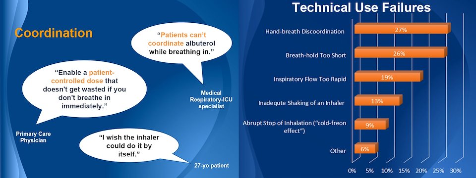
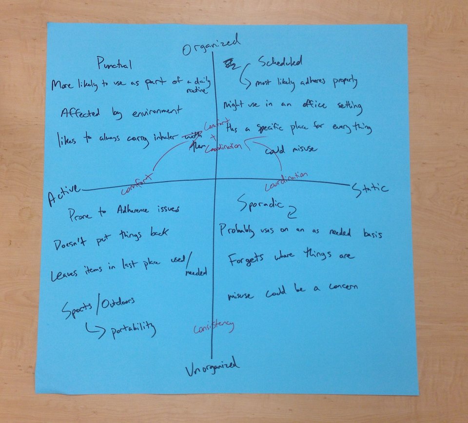
We gathered together key insights that we had found through doing stakeholder interviews and identified big themes.
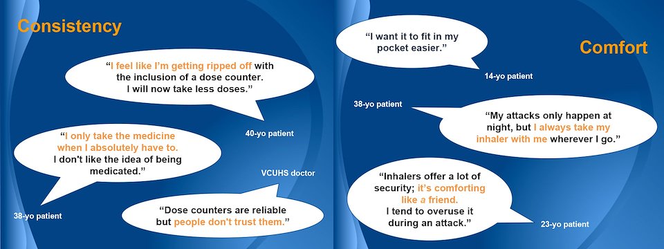
Every solution we build had to tie back to an insight we had found. The key themes we arrived at were User Coordination in administering the medicine, Consistency through re-filling on time, and Comfort people found from their inhalers.
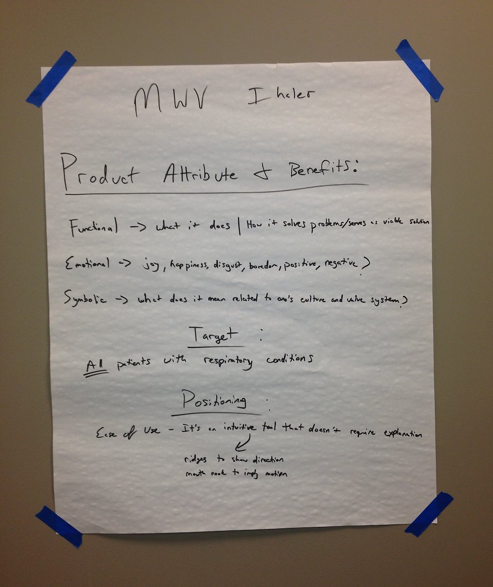
We wanted to define the essential attributes and benefits while considering our targeted market.
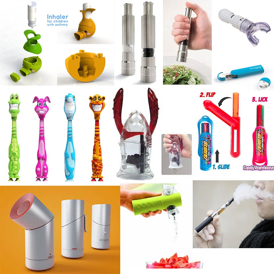
From there, we made an inspiration board. The goal for this was simple. Get outside the device itself and explore other products a probably consumer would interact with on a daily basis – understand what functional actions they are already familiar with. And obviously, gain inspiration for form and function
Our persona’s, based on research and feedback we’d received about initial prototypes.
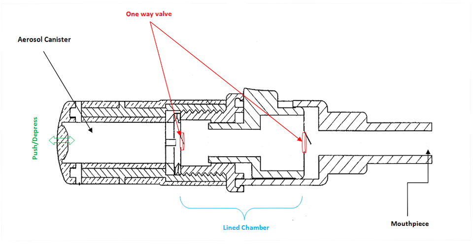
Exploring functionality and if proposed solutions were actually within the realm of possibility.
Iterate, iterate, iterate.
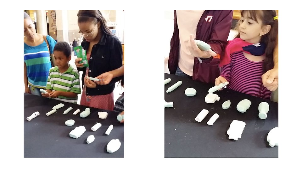
Constant feedback… that was our mantra. We made rough mock-ups out of clay and foam. Continually getting user feedback on what they liked, and didn’t.
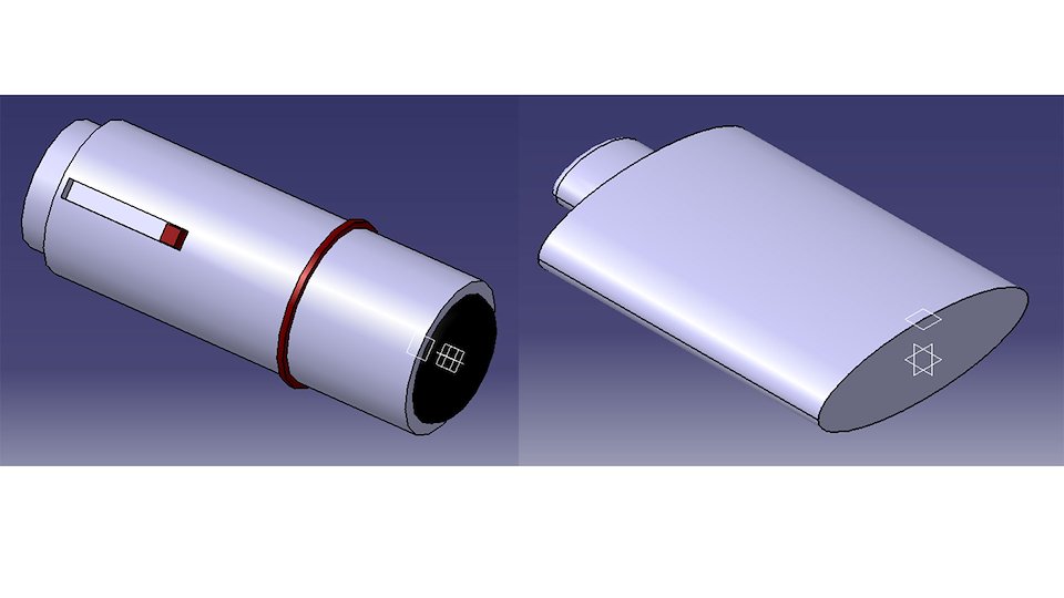
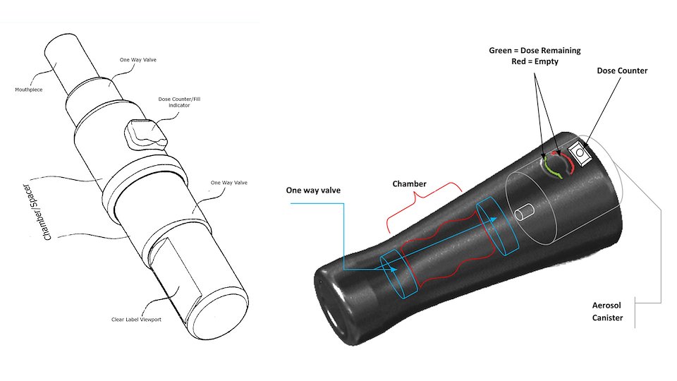
Based on the feedback we received, we were ready to 3-d print our functional prototype. Here are some CAD mockups we designed.
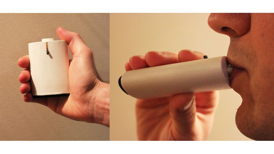
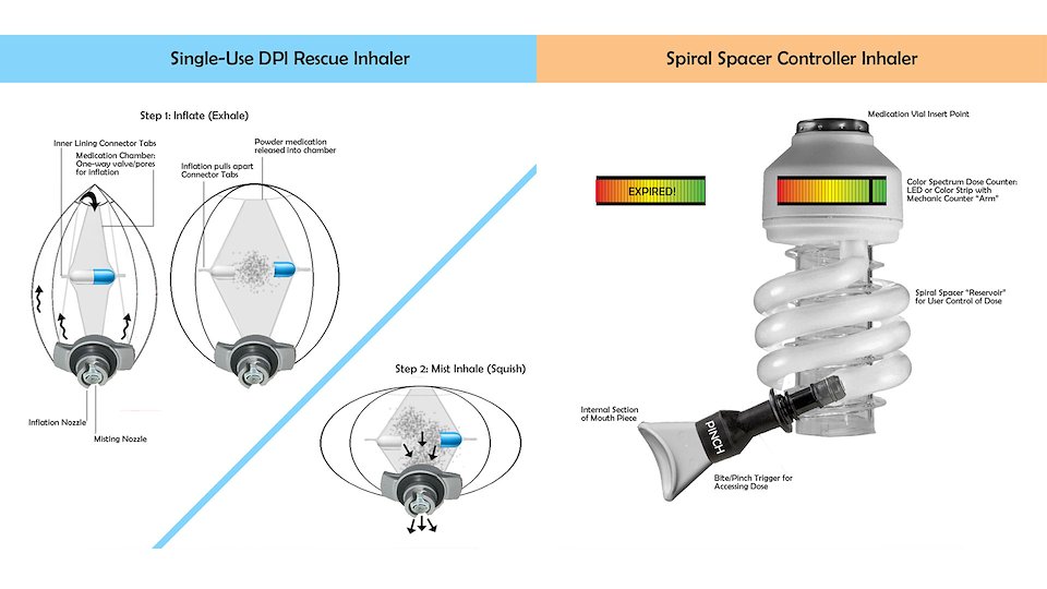
Our final prototype, which applied function of decreasing the need for user coordination when taking the medicine – the patient only has to breathe in. Changing the dose counter to a gradient color scale to make people more comfortable with the indicator. And lastly, applying ergonomics in our form to ensure people got the comfort they desired.
Web Next
Film